Delta Kiosk
Role: Lead Interaction DesignerOverview
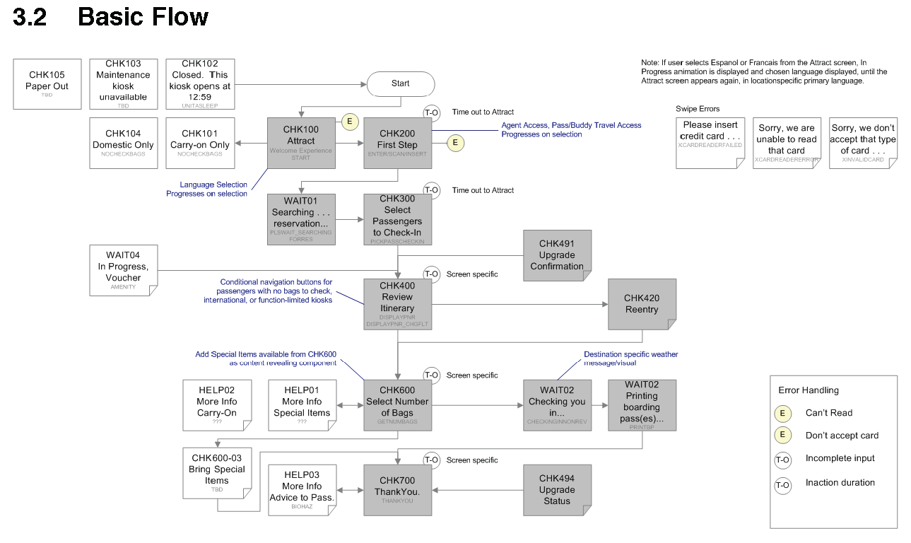
Our team was asked to increase the adoption of the self-service kiosk to allow agents to focus on more complicated itineraries, as well as aligning to the updated branding guidlines. My role as the lead interaction designer focused on simplifing the steps to complete the check-in process. I created flow diagrams to review the each pathway, indicating which areas the team would focus our improvement efforts.

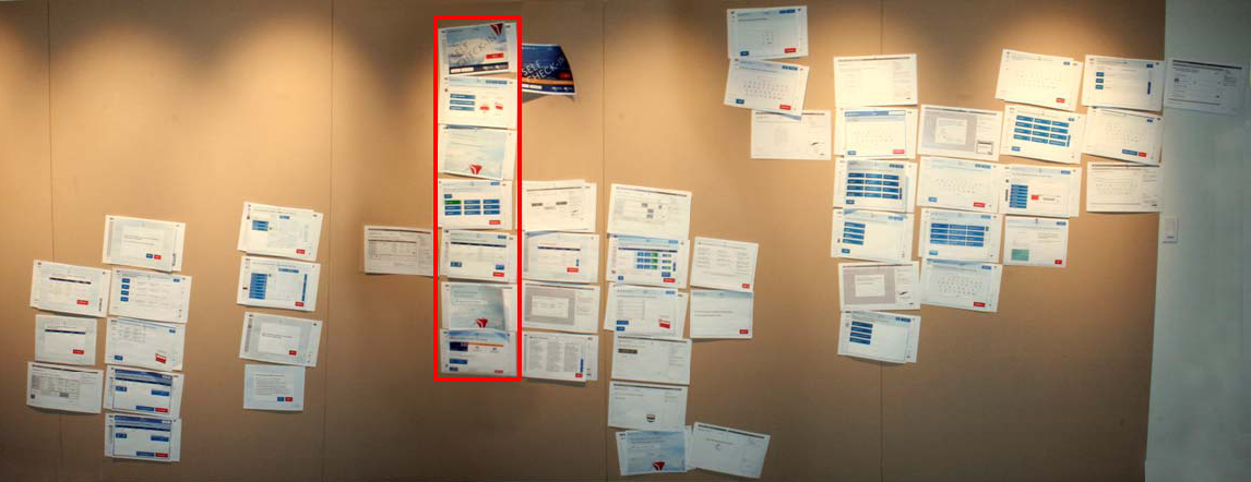
Once we had approved high level flows, I started to create 'The Wall', which visually indicated the entire site structure, initially as wireframes. As the project progressed, newer versions of each page was taped on top of the older version. This allowed our team to rapidly see the current status, the previous iteration, and collaborate on the next stages in the visual design, as well as the messaging.
